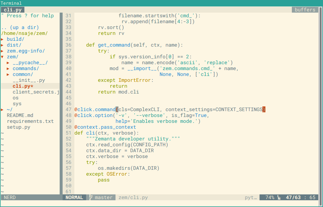
From time to time the coworkers who stop by my desk ask me something along the lines of "Is that a yellow background? How can your eyes stand that, isn't light text on a dark background better for the eyes?"

That is a common misconception among programmers, myself included until a few years back. I reasoned that since light text on a dark background emits less light overall, it must be easier on the eyes. But that is not actually the case, as is wonderfuly explained in this UX StackExchange answer:
There has been a lot of research on this topic since the 1980s and a lot of it still holds true today. One study from the 1980s states this:
However, most studies have shown that dark characters on a light background are superior to light characters on a dark background (when the refresh rate is fairly high). For example, Bauer and Cavonius (1980) found that participants were 26% more accurate in reading text when they read it with dark characters on a light background.
Reference: Bauer, D., & Cavonius, C., R. (1980). Improving the legibility of visual display units through contrast reversal. In E. Grandjean, E. Vigliani (Eds.), Ergonomic Aspects of Visual Display Terminals (pp. 137-142). London: Taylor & Francis
The reason why this matters is because of focus. As this article on UXMovement states, "white stimulates all three types of color sensitive visual receptors in the human eye in nearly equal amounts." It causes the eye to focus by tightening the iris. Since the eye is focused, dark letter forms on light backgrounds are easier to read. When using a dark background with strong light letter forms, the iris opens to allow more light in, but that causes letter forms to blur. Why?
People with astigmatism (approximately 50% of the population) find it harder to read white text on black than black text on white. Part of this has to do with light levels: with a bright display (white background) the iris closes a bit more, decreasing the effect of the "deformed" lens; with a dark display (black background) the iris opens to receive more light and the deformation of the lens creates a much fuzzier focus at the eye.
Jason Harrison – Post Doctoral Fellow, Imager Lab Manager – Sensory Perception and Interaction Research Group, University of British Columbia
Now there seem to be varying factors into contrast and legibility. Room ambient lighting. Brightness of the monitor. Also you can mitigate the straining effects of white (#FFF) on black (#000) by simply lessening the contrast like using a light gray (#EEE, #DDD, #CCC) on a dark background (#111, #222).
The last paragraph mentions that white on black can indeed be a bit straining on the eyes. I use Solarized Light, a color scheme with just the right amount of contrast for best legibility and a background with reduced blue light content compared to a white background. And yes, it's yellow.